Comprising 36 meticulously crafted weights, including standard and alternate versions with corresponding italics, Princesa boasts an expansive repertoire covering Cyrillic characters and 4 stylistic sets, offering versatility by replacing nearly 40 characters. This breadth renders Princesa an ideal choice across diverse applications—be it editorial design, headline compositions, or branding endeavors—seamlessly blending sophistication, refinement, and enduring classical allure with a contemporary edge.
Tuesday, April 30, 2024
Princesa: A Timeless Typographic Triumph
Princesa embarks on a captivating voyage through epochs, drawing inspiration from the grandeur of ancient Roman letterforms while deftly tackling modern typographic demands. The brainchild of Enrique and Eli Hernández, a father-daughter duo, this typeface emerges from two years of meticulous craftsmanship, boasting striking contrasts and entrancing contours that bestow upon it a subtle yet unmistakable character. Noteworthy is the invaluable input from the Latinotype team, enriching the design journey.
Comprising 36 meticulously crafted weights, including standard and alternate versions with corresponding italics, Princesa boasts an expansive repertoire covering Cyrillic characters and 4 stylistic sets, offering versatility by replacing nearly 40 characters. This breadth renders Princesa an ideal choice across diverse applications—be it editorial design, headline compositions, or branding endeavors—seamlessly blending sophistication, refinement, and enduring classical allure with a contemporary edge.
Subscribe to:
Post Comments (Atom)
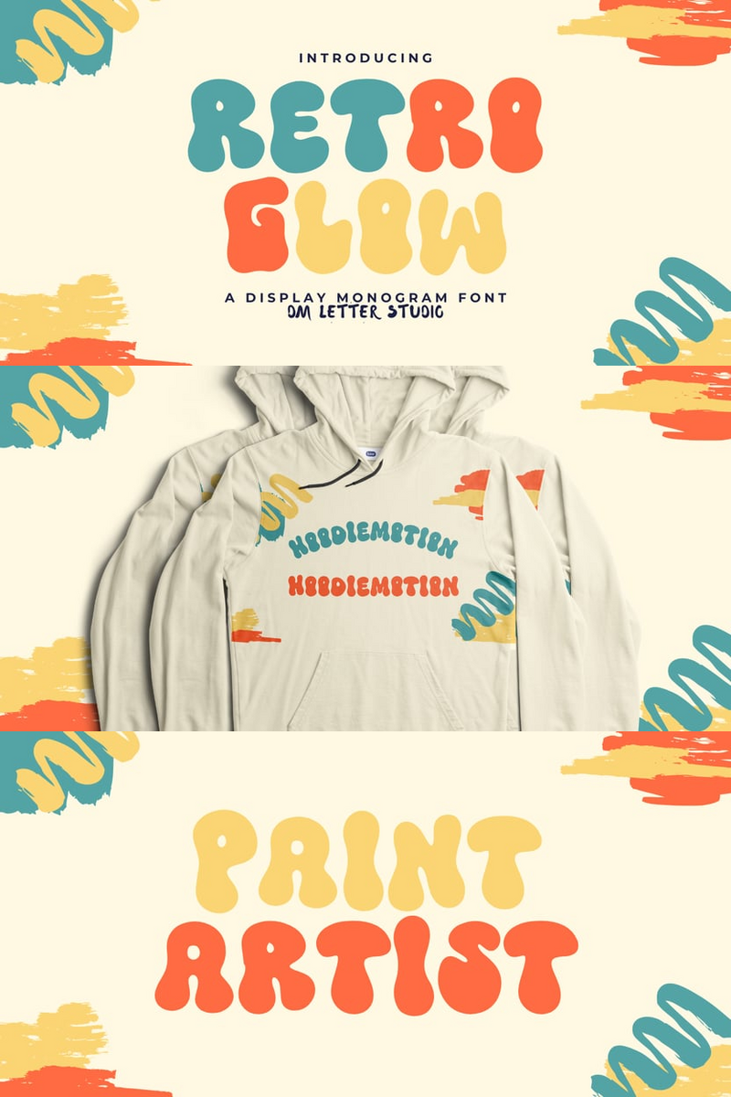
In a Crowded Market, Can Retro Glow's Experimental Artistry Make Your Indie Game's Website Headlines Unforgettable?
Indie game developers pour their passion into creating worlds that defy convention, yet often struggle to find a visual voice as unique as t...
-
In my contemplative quest spanning several years, the conception of the Polin Sans typeface germinated, a marriage between modernist aesthet...
-
In the realm of typography, "Enchanted Tales" reigns supreme as a captivating serif font that seamlessly marries classic elegance ...
-
Meet Westerland Grotesk, the sans-serif font family that elegantly blends timeless simplicity with contemporary refinement. With a subtle co...

No comments:
Post a Comment