Tuesday, April 30, 2024
The Evolution of Hotshoe Magazine's Typeface
Hotshoe magazine's typeface underwent a transformative journey, originating as a single Regular style. It evolved into a versatile seven-style font family, meticulously crafted for the magazine's re-design. Through rigorous testing on various platforms, both digital and print, its efficacy was proven. This typographic evolution symbolizes Hotshoe's commitment to innovation and adaptability, ensuring its visual identity remains dynamic and resonant with its audience.
Subscribe to:
Post Comments (Atom)
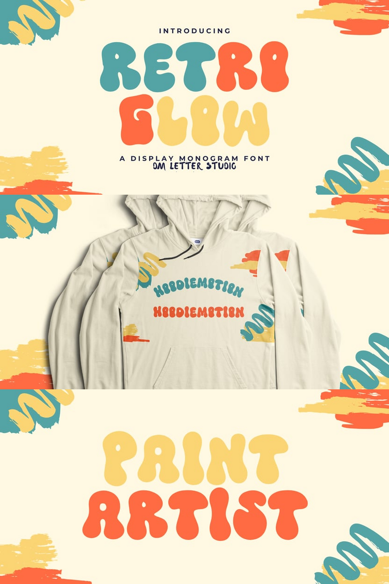
In a Crowded Market, Can Retro Glow's Experimental Artistry Make Your Indie Game's Website Headlines Unforgettable?
Indie game developers pour their passion into creating worlds that defy convention, yet often struggle to find a visual voice as unique as t...

-
Neugro Typeface emerges as an innovative and elegant addition to the realm of modern fonts. Its experimental sans serif design boasts orthog...
-
Red Oak introduces a fresh perspective to the timeless wedge-serif style, seamlessly merging sophistication with adaptability. The font exud...
-
Ever felt like your designs are missing that special touch, the one that makes them pop and truly stand out? Imagine a font that combines th...


No comments:
Post a Comment