Sunday, October 19, 2025

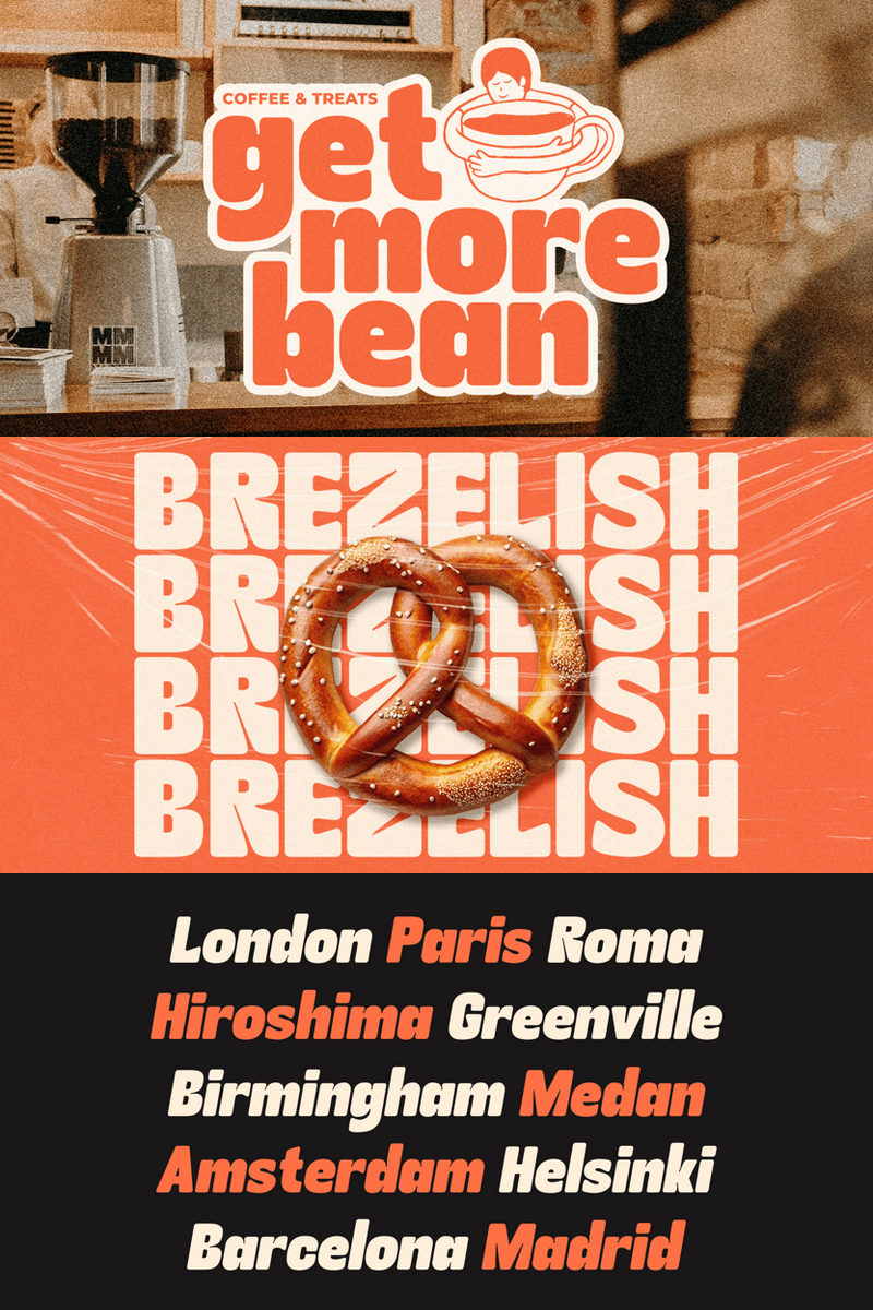
How Can Kindly Rumina Transform Your Social Media Headlines, like 'Unlock Your Potential' or 'Inclusive Design Tips,' into Engaging, Accessible Messages?

Hey there, awesome creator! Mind if I introduce myself? I'm Kindly Rumina, and I'm not just another font – think of me as your new creative partner, ready to make your social media content truly shine. I know you're busy crafting magic online, telling incredible stories, and building vibrant communities. And let's be honest, getting your message seen and understood by everyone can be a real juggle. That's where I confidently step in!

Picture this: you've poured your heart into a new post, a captivating story, or a killer infographic. Now, imagine every single person who encounters it instantly grasping your words, feeling that connection, without an ounce of strain. That's the world I help you create. My journey began with a simple idea: clarity doesn't have to be cold, and accessibility can absolutely be beautiful. I'm specifically designed with high readability in mind, ensuring that my characters are distinct, well-spaced, and incredibly easy on the eyes, whether your audience is scrolling on a phone, tablet, or desktop.

So, what makes Kindly Rumina special? I solve that common design challenge of needing a font that's both professional and friendly, entirely accessible, and yet brimming with personality. I make sure your genius isn't lost in translation or overlooked due to hard-to-read text. My gentle curves and open forms offer a welcoming presence, making your audience feel invited, not excluded. I'm crafted to be the friendly voice your brand deserves, ensuring that your content resonates with everyone.

My memorable tagline? Kindly Rumina: Clarity with a Heart.

Where do I shine the brightest? Oh, just about everywhere! I'm perfect for those crucial Instagram captions that need to be clear and concise. I look fantastic as a YouTube video title, drawing viewers in with an approachable yet authoritative feel. Think blog post headers that promise easy reading, or infographic text that simplifies complex information. I’m also brilliant for crafting accessible website headlines and body text, ensuring your brand's digital home is welcoming to all visitors. And for those social media graphics? I’ll make your calls to action pop and your quotes unforgettable.

Ready to make your content truly inclusive and effortlessly beautiful? I'm just waiting to jump into your projects, ready to help your message resonate further and wider than ever before. Why not give Kindly Rumina a spin? Come say hello and learn more about how I can elevate your work and connect you with every single one of your followers. I promise, we'll make a great team!


How Can Kindly Rumina Transform Your Social Media Headlines, like 'Unlock Your Potential' or 'Inclusive Design Tips,' into Engaging, Accessible Messages?

Architecting Tomorrow's Brand Voice: How Kitora's Futuristic Precision Shapes SaaS Headlines Like "Quantum Leaps in UX" and "Predictive Intelligence, Perfected"

In the relentless pulse of the tech landscape, where innovation is the currency and clarity is king, how does your brand truly speak? Generic typefaces whisper, but your vision demands a voice that resonates with tomorrow. For Tech and SaaS companies striving for distinction, the choice of typography isn't merely aesthetic; it's a foundational act of brand building and user experience design.

Enter Kitora, not just a font, but a meticulously sculpted vision of the future. Each character is a testament to advanced geometry and refined aesthetics, born from the intersection of human creativity and digital precision. It’s where the sharp, analytical edge of code meets the fluid grace of design. Kitora doesn't just display text; it composes an experience, conveying a sense of engineered beauty and sophisticated intelligence. Its unique traits lie in its subtle angles, expansive yet controlled letterforms, and an innate sense of balance that whispers "innovation" without a shout. This isn't just typography; it's a design language forged for the digital age, a beacon of futuristic precision.

Imagine a SaaS dashboard, cluttered and visually indistinct. Your groundbreaking analytics are lost in a sea of conventional typography, leading to user fatigue and missed insights. Users struggle to differentiate key metrics from secondary information, diminishing the impact of your product's brilliance. Now, envision that same dashboard rendered with Kitora. Suddenly, critical data points leap forward with crisp authority. Headlines like "Performance Overview" and "Q3 Projections" gain immediate visual hierarchy, making complex information instantly digestible. The user journey becomes intuitive, guided by Kitora's inherent clarity and clean lines, transforming a merely functional interface into an engaging, high-performance command center. The challenge of communicating complex information elegantly is solved, not just with new features, but with a foundational shift in how information is perceived.

Kitora stands apart by design, offering a unique blend of benefits crucial for Tech & SaaS. It guarantees unparalleled readability, even in dense data displays or at smaller UI scales, ensuring your complex messages are always crystal clear. For brand identity, Kitora projects an aura of cutting-edge sophistication and trustworthiness, signaling to your audience that your solutions are engineered for the future. Its visual impact is immediate and lasting, transforming generic interfaces into captivating digital experiences that enhance user engagement and reduce cognitive load. Kitora makes your platform feel advanced, intuitive, and expertly crafted, solidifying your position as a leader.

From the grand statement of your website headlines ("Unlocking AI's Potential," "Your Growth, Accelerated") and marketing campaigns to the precise execution within app interfaces, dashboards, data visualizations, and onboarding flows, Kitora brings a consistent, futuristic elegance. It's the ideal choice for product names, feature descriptions, and any textual element demanding both visual authority and effortless comprehension in a digital product. It's the typeface that makes your innovative solutions look and feel as intelligent as they are.

Kitora: Shape Tomorrow. Precisely.

Explore the Kitora experience and redefine your digital presence. Learn more.


Architecting Tomorrow's Brand Voice: How Kitora's Futuristic Precision Shapes SaaS Headlines Like

Friday, October 17, 2025

Komtha Protha: Can Its Bold Minimalism Redefine Your Luxury Brand's Editorial Authority?

In the fiercely competitive realm of luxury, silence speaks volumes. But how do you capture that profound quiet, that undeniable presence, in a world saturated with visual noise? You don't just choose a font; you choose a statement.

Enter Komtha Protha. This isn't merely a typeface; it's an architectural marvel of modern minimalism, meticulously crafted for the discerning eye of fashion and luxury brands. Every curve, every line, every counter is a testament to precision and purpose. Komtha Protha strips away the superfluous, leaving behind pure, unadulterated sophistication. Its bold yet graceful structure commands attention without shouting, whispering tales of timeless elegance and contemporary edge. Think razor-sharp terminals meeting expansive, confident letterforms – a delicate dance between strength and fluidity that defines the Komtha Protha aesthetic.

Imagine launching a groundbreaking new collection – perhaps a limited-edition haute couture line or an avant-garde fragrance. Your visuals are stunning, your concept revolutionary. Yet, the typography feels... safe. It blends in, fails to capture the visceral thrill of your innovation. The challenge: how to convey unparalleled exclusivity and daring modernity without resorting to cold austerity or fleeting trends. This is where Komtha Protha becomes your indispensable partner. Its clean, confident lines don't just carry information; they embody the very essence of your brand's pioneering spirit. Picture it as the headline for your editorial spread in Vogue, or the product name on a minimalist, frosted-glass flacon – instantly communicating authority and an effortless, coveted allure.

Komtha Protha isn't just a font; it's a strategic asset designed to elevate.* Uncompromising Clarity: In an age of information overload, Komtha Protha ensures your message cuts through the noise. Its exquisite readability, even at smaller sizes, means every nuance of your luxury narrative is absorbed, never overlooked.* Effortless Sophistication: This is modern minimalism without the starkness. It exudes an approachable grandeur, a quiet confidence that resonates deeply with a high-end audience seeking authenticity and understated luxury.* Versatility with an Edge: From the striking impact of large headlines to the refined elegance of body copy, Komtha Protha adapts. It performs flawlessly across print, digital, and experiential touchpoints, ensuring a cohesive and distinguished brand voice everywhere.* Brand Resonance, Amplified: When your typography aligns perfectly with your brand's ethos, it builds an emotional connection. Komtha Protha helps forge an unforgettable identity, making your brand not just seen, but felt.

Envision Komtha Protha gracing the pages of your next seasonal lookbook, its clean lines framing breathtaking photography. See it on the meticulously designed labels of bespoke artisanal products, or commanding attention in a high-impact advertising campaign. It's the perfect choice for compelling digital interfaces, luxurious packaging, exclusive event invitations, and the definitive mark for any luxury brand seeking to solidify its modern minimalist identity with a distinct voice.

Komtha Protha: Silence the Noise. Command Attention.

Stop blending in. Start defining.Unleash the power of uncompromising minimalism.Discover the unparalleled impact of Komtha Protha for your luxury brand.Download Komtha Protha now and transform your vision into an undeniable statement.


Komtha Protha: Can Its Bold Minimalism Redefine Your Luxury Brand's Editorial Authority?

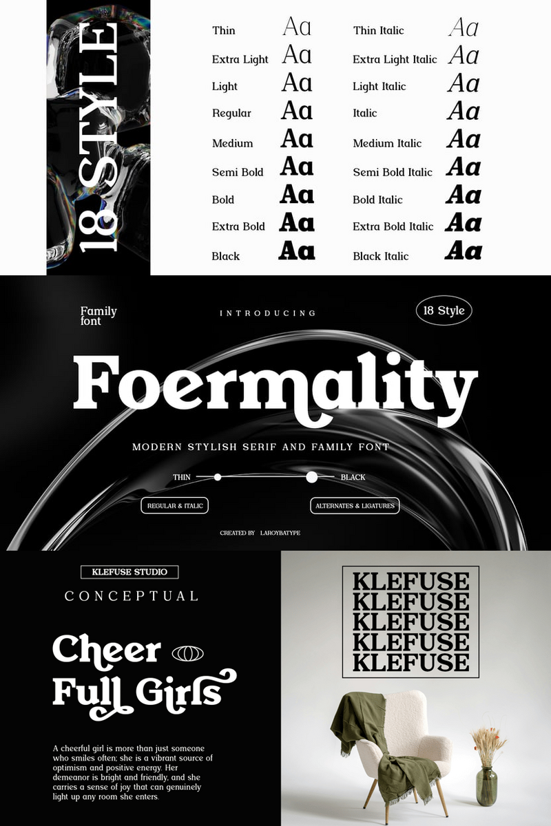
How to Infuse Handcrafted Soul into Your Lifestyle Blog Headlines with Foermality Serif

Imagine a typeface that carries the warmth of a hand-penned letter and the character of a cherished heirloom. Foermality Serif isn't just a font; it's a testament to authenticity, each stroke imbued with a genuine, human touch. It gracefully eschews the rigid perfection of digital precision for an organic elegance that feels deeply personal. Its refined serifs and subtly varied lines evoke a sense of thoughtful craftsmanship, a quiet confidence that speaks volumes to your audience. This is the distinct personality of Foermality Serif, designed to breathe life into your digital presence.

As a dedicated lifestyle blogger, you pour your heart into every post, every image, every story. But sometimes, your beautiful words can get lost in a sea of impersonal typography, leaving your brand identity feeling generic. You crave a visual voice that truly echoes the passion and handcrafted authenticity of your content – a font that feels less like a template and more like an extension of your unique soul. This common design challenge, the quest for a distinctive and relatable visual language, is precisely where Foermality Serif steps in.

With Foermality Serif, your brand doesn't just look professional; it feels real. It’s a powerful tool for lifestyle bloggers seeking to forge deeper, more meaningful connections with their readers.

  • Forge Deeper Connections: Its inviting, handcrafted presence creates an immediate sense of trust and intimacy, allowing your readers to connect with your message on a more profound, emotional level. Each character whispers a story of genuine care.
  • Unmistakable Brand Identity: Say goodbye to bland. Foermality Serif provides a distinctive visual signature, helping you build a memorable and beloved brand that resonates with genuine character and stands out in a crowded online world.
  • Effortless Elegance & Readability: While celebrating the art of the handcrafted, Foermality Serif maintains exceptional readability. Its balanced forms ensure your heartfelt stories are always a joy to consume, whether in a striking headline or a flowing paragraph, making it an essential typeface for any lifestyle blogger.

Foermality Serif: Authenticity, Artfully Scripted.

Envision Foermality Serif gracing your website headlines, drawing readers in with its warm, approachable authority. Picture it enhancing your blog post titles, turning each one into a mini-masterpiece. Use it for captivating quote graphics that inspire, or within your social media templates to instantly brand your visual content with handcrafted authenticity. It’s equally at home in your e-books, digital products, or even subtle watermarks, weaving a consistent thread of bespoke charm throughout your entire online presence.

This isn't just another font; it's the missing piece in your brand's narrative, an essential tool for creating an immersive and authentic experience for your audience. Uncover the unique charm of Foermality Serif. Download now and transform your brand's narrative into a beautifully crafted legacy.


How to Infuse Handcrafted Soul into Your Lifestyle Blog Headlines with Foermality Serif

Sunday, August 17, 2025

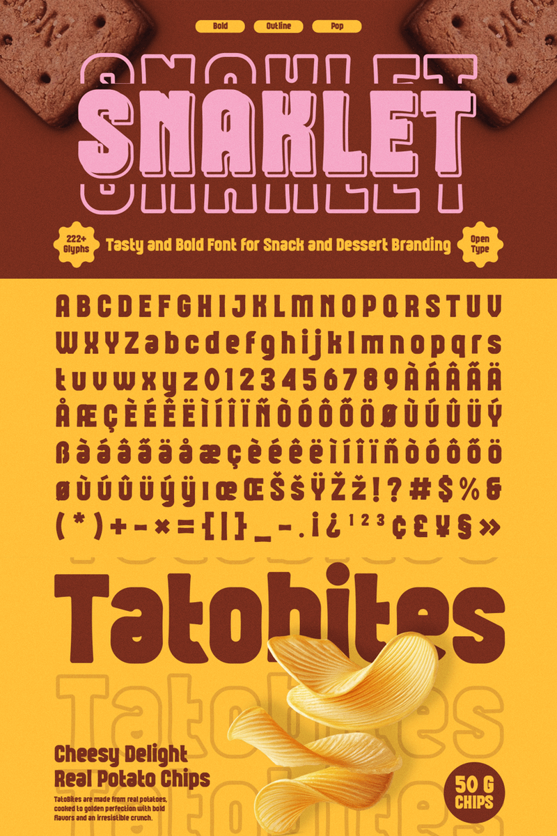
Seeking a Font That Makes "Unleash Pure Joy" or "Ignite Creative Sparks" Pop? Could Snaklet Be Your Agency's Playful Powerhouse?

Ever feel like your creative palette needs a splash of unadulterated joy? In a world saturated with sleek lines and minimalist aesthetics, truly standing out means forging genuine, memorable connections. For creative agencies striving to capture the heart of a brand, finding that perfect typeface — the one that instantly communicates personality and warmth — is a constant, delightful challenge.

Meet Snaklet, the font designed to be your next go-to for playful energy and irresistible charm. Snaklet isn't just a collection of characters; it's a personality. Imagine a friendly, wiggling line that decided to be a letter – organic, delightfully bouncy, and brimming with infectious charm. Its gently rounded edges and distinctive, almost hand-drawn curves evoke a sense of carefree fun, making every word feel like a playful whisper or a cheerful shout. It’s the visual equivalent of a spontaneous giggle, bringing a unique brand of positive vibrance to any design.

This is where the Snaklet font truly shines in your agency’s toolkit. It’s crafted for those moments when you need to convey warmth, approachability, and a touch of genuine whimsy without sacrificing professionalism. Think of it as your secret weapon for brands that don't take themselves too seriously, but take their connection with their audience very seriously indeed. Snaklet makes it effortless to imbue your projects with a human touch, ensuring your designs feel inviting and authentic, rather than cold or generic.

With Snaklet, you’re not just choosing letters; you’re choosing an emotional connection. Its inherent playful energy cuts through the noise, making your designs pop and resonate on a deeper level. It helps foster an immediate sense of friendliness and approachability, inviting audiences to lean in closer and feel good about what they’re seeing. From making website headlines like “Discover Your Playful Brand” genuinely irresistible, to ensuring a social media graphic for “Happy Little Moments” feels truly joyful, Snaklet delivers powerful visual impact and creates lasting positive impressions. This unique playful font is versatile enough to bring a lighthearted touch to more serious messages or amplify the pure fun of a children's brand, making it a valuable asset for diverse client needs.

Snaklet: Design with a Smile.

Picture Snaklet gracing website headlines for lifestyle brands, turning “Explore Your Fun Side” into an irresistible invitation. Envision it on packaging for artisanal snacks or eco-friendly toys, adding a touch of handmade charm and a promise of delight. Or see it animating social media campaigns with messages like “Weekend Adventures Await!” Its distinctive look also shines in playful logos, event branding for community gatherings, and even unique merchandise designs that aim to spread cheer. This font is your go-to for injecting personality and a sense of happy discovery wherever it’s needed.

Ready to infuse your next project with a dose of delightful energy? Experience the unique charm of Snaklet font for yourself. Download now.


Seeking a Font That Makes

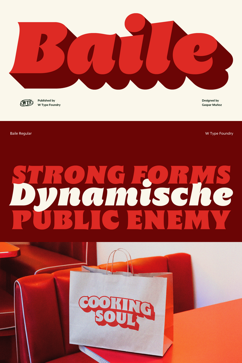
Beyond Generic: How Baile, the Playfully Sophisticated Typeface, Transforms Indie Game Logos and Brand Identities into Unforgettable Experiences – From Whimsical Main Titles to Charming Character Markings.

In the vibrant, often chaotic, world of independent game development, your vision is your legacy. Every pixel, every line of code, every narrative beat is a testament to your meticulous craft. Yet, how does one ensure that this meticulous artistry truly resonates, captivating players from the very first glance? Enter Baile.

Baile isn't merely a typeface; it's a carefully orchestrated symphony of sophisticated whimsy. Imagine the fluid grace of a dancer, imbued with an undeniable spark of playful energy. Its unique letterforms possess a gentle bounce and an unexpected twist, yet maintain an elegant clarity that speaks volumes without shouting. The Baile font evokes a feeling of approachable charm, an invitation to a world where joy and refined design coalesce, setting a distinctive tone for your game's identity.

For the discerning indie developer, Baile is the secret ingredient that transforms a concept into an experience. It’s the typeface that makes your game’s title screen feel like a warm embrace, your character dialogue bubble with authentic personality, and your overall brand logo instantly recognizable yet utterly unique. No longer content with sterile or overly saccharine typefaces, you seek a visual language that speaks to both your artistic integrity and your game’s spirited core. Baile answers that call, providing a harmonious balance that feels both fresh and timeless, allowing your Baile font game titles to truly shine.

The true power of Baile lies in its ability to forge an instant emotional connection. It’s about more than just readability; it's about crafting an unforgettable identity. From creating an iconic game logo that exudes a distinct, memorable charisma, to designing user interfaces that feel intuitive and joyfully interactive, the Baile typeface ensures your game's personality shines through. It addresses the inherent challenge of conveying playful energy without sacrificing professionalism, enabling you to build a brand that is both approachable and deeply respected. Your players will not just interact with your game; they will feel its unique spirit, beautifully conveyed by the Baile font.

Baile: Where Play Meets Polish.

Envision Baile gracing the cover of your next title, its playful elegance hinting at the adventures within. Picture it defining your in-game menus, offering a subtle smile with every interaction. Consider its versatility for compelling character names on splash screens, or even for distinctive marketing collateral that stands out in a crowded digital marketplace. Baile is not just a font; it’s an extension of your creative vision. Discover the transformative power of playful elegance. Download Baile now.


Beyond Generic: How Baile, the Playfully Sophisticated Typeface, Transforms Indie Game Logos and Brand Identities into Unforgettable Experiences – From Whimsical Main Titles to Charming Character Markings.

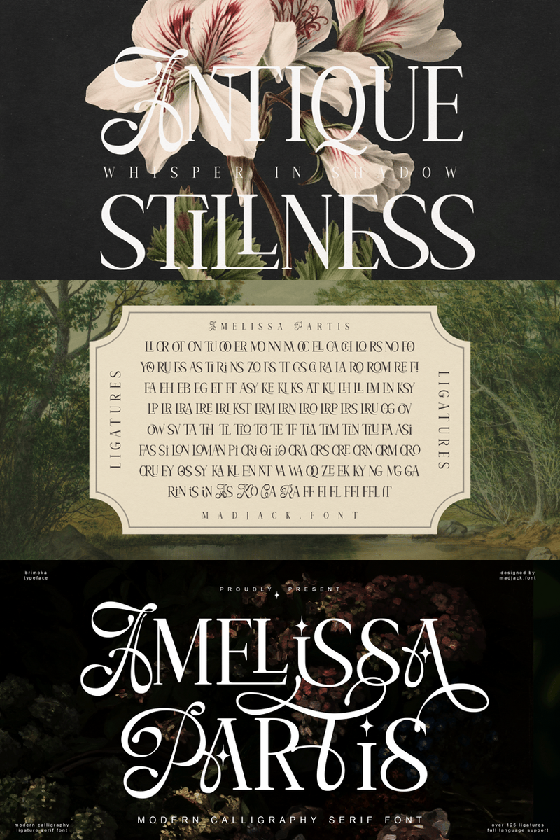
Amelissa Partis: Why Nostalgic Charm is Your Tech & SaaS Brand's New Logo Superpower

Imagine a font that feels like a cherished memory, a warm whisper from the past, or that perfectly worn-in album cover. Amelissa Partis isn't just another typeface; it's a design journey back to a time when things felt simpler, more authentic. This unique font captures a beautiful vintage and nostalgic charm, designed to infuse your brand with a genuine, comforting warmth that truly stands out.

In the rapidly evolving, often sleek and sometimes sterile world of tech and SaaS, building authentic connections with your audience is paramount. Your users aren't just looking for innovative solutions; they're seeking brands they can trust, connect with, and remember. This is precisely where the Amelissa Partis font steps in. Think about those timeless brands that resonate deeply—they possess a certain 'soul' beyond their functionality. Amelissa Partis helps you embed that very soul into your brand's visual identity.

Using Amelissa Partis helps your SaaS brand cut through the digital noise. It crafts instant rapport and an emotional connection, making your audience feel like they've known you forever. This unique blend of vintage warmth within a modern tech context positions your brand as approachable, reliable, and profoundly memorable. It’s about building trust not just with logic and features, but with genuine feeling and character.

Amelissa Partis: Your Brand's Nostalgic North Star.

Consider your new SaaS platform’s logo, beautifully crafted with Amelissa Partis. Instead of feeling cold and purely functional, it instantly evokes a sense of being a trusted, human-centric partner. Picture a burgeoning productivity app using the Amelissa Partis font in their core logo design to convey that their solution isn’t just about efficiency, but about reclaiming time for what truly matters – a nostalgic echo of simpler, more focused eras. Or perhaps a data analytics company leveraging its comforting warmth in sub-headings on their dashboard, making complex information feel less daunting and more approachable. From an iconic logomark that captures attention in a crowded app store to a website headline that invites a deeper exploration, Amelissa Partis effortlessly blends professional appeal with an irresistible, comforting aura. It's ideal for a retro-themed feature announcement, a "throwback" marketing campaign, or simply giving your core brand identity a unique, warm twist that ensures your tech font is as memorable as your product.


Amelissa Partis: Why Nostalgic Charm is Your Tech & SaaS Brand's New Logo Superpower

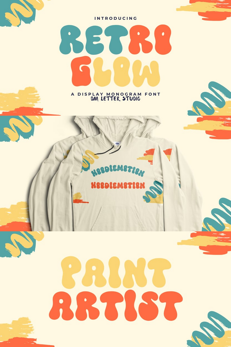
In a Crowded Market, Can Retro Glow's Experimental Artistry Make Your Indie Game's Website Headlines Unforgettable?

Indie game developers pour their passion into creating worlds that defy convention, yet often struggle to find a visual voice as unique as t...