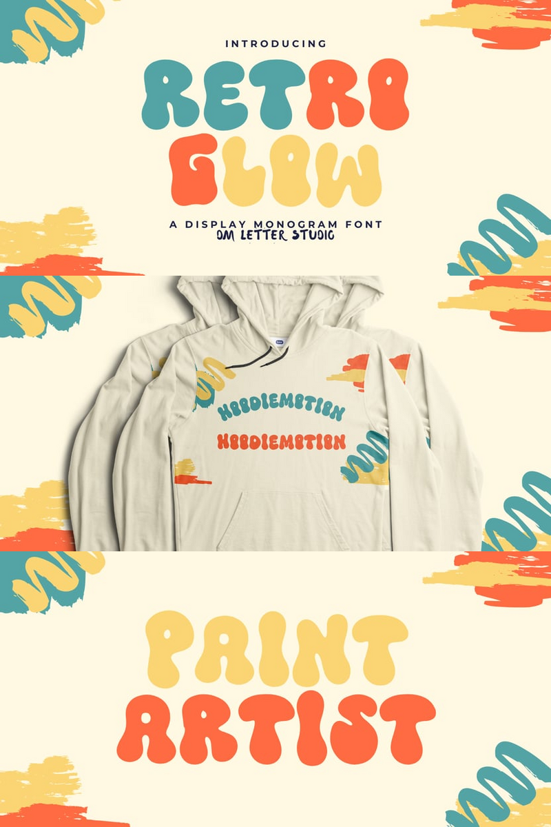
Named after the stilt-like "zancos" of acrobats towering above jubilant crowds, the typeface carries this elevated spirit across its diverse styles. From hefty, funky platforms to delicate lifts with an ethereal, art nouveau aura, Zanco exudes a curved, melty, and slightly nostalgic charm. It's a harmonious blend of relaxation, versatility, legibility, sensuality, and functionality all in one.
Perfect for brand identities with soul, packaging that speaks volumes, and messaging that effortlessly resonates, Zanco finds its home on posters, billboards, and dynamic motion graphics that leap off the screen. Crafted by Alexander Wright of the In-House Int’l studio foundry and developed by Rodrigo Fuenzalida, Zanco stands as a testament to creativity. In-House International, the visionary agency behind it, continues to deliver branding innovations for the bold trailblazers of tomorrow.


No comments:
Post a Comment