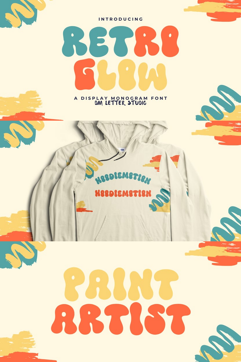
Imagine having a font that captures the spontaneity of handwritten notes while still maintaining a polished, professional feel. Sounds too good to be true? Let’s dive into how Respondent can transform your work, and I promise you’ll be ready to embrace this lively typeface in no time.
What Makes Respondent Fonts Stand Out?
Respondent, crafted by the talented Måns Grebäck in 2021, is more than just a pretty face. Inspired by the vibrant lettering of GTA Vice City, this font family brings a unique character that’s both wild and vivid. Whether you're designing a logo, crafting a social media post, or laying out a brochure, Respondent offers a touch of authenticity that can make your work truly stand out.
The Problem: Finding the Right Font
Let’s be honest—many fonts out there look sterile and lifeless. You might worry that using a handwritten style could feel too casual or unprofessional. It’s a common concern! However, the beauty of Respondent is its versatility. With five distinct weights—Thin, Light, Medium, Bold, and Black—you can find the perfect balance between fun and formality, making it suitable for a wide range of contexts.
Overcoming Objections
You might be thinking, “But isn’t handwritten font just for casual projects?” Not with Respondent. Its advanced OpenType functionality and extensive language support mean you can use it for serious business too! The font offers stylistic and contextual alternates, ligatures, and all the characters you need, ensuring that you can customize your design to fit any brand voice.
And if you're worried about readability, rest easy! Respondent maintains clarity, making it ideal for both headlines and body text. So whether you’re targeting a young audience or a more sophisticated demographic, this font can adapt to your needs.
How to Use Respondent in Your Designs
Ready to give Respondent a try? Here are a few tips to incorporate it seamlessly into your projects:
Branding: Use the bold weight for your logo and mix in lighter styles for marketing materials to create a cohesive look that feels inviting.
Social Media: Capture attention with eye-catching posts that feature Respondent in a creative layout—its unique flair will stop scrollers in their tracks.
Print Materials: For brochures or flyers, use Respondent to highlight important information, giving your text a personal touch that resonates with your audience.
Keep the Conversation Going
Feeling inspired yet? The beauty of Respondent is that it opens up endless possibilities for creativity. Whether you're a seasoned designer or just starting out, incorporating this font can breathe new life into your projects. So why not give it a shot?
Explore the vast landscape of design with Respondent fonts, and let your creativity run wild. Your next masterpiece is just a font choice away!


No comments:
Post a Comment