Thursday, December 28, 2023

Unveiling Nomos: A Raw and Honest Brutalist Typeface

Nomos, a superfamily of fonts, transcends the boundaries of a precise definition of a brutalist typeface, leaving it open to interpretation. Drawing inspiration from the architectural style it is named after, Nomos embodies rawness, directness, and honesty. Its unpolished aesthetics lay bare an orderly construction deeply rooted in classic modernism, seamlessly merging with the demands of the digital era.

Nomos Sans, a subfamily within the Nomos superfamily, presents a low-contrast neogrotesk featuring 18 distinctive styles and an expansive character set exceeding 1000 characters. This font exudes confidence, making it a compelling choice for diverse applications—from the realms of fashion and finance to the spheres of apps and advertising. Nomos Sans is versatile, maintaining humility and efficiency in body text while radiating strength and vigor in larger display sizes.

Nomos Sans finds extra finesse when paired with Nomos Slab, creating a harmonious synergy between the two subfamilies. In essence, Nomos stands as a testament to the marriage of simplicity and functionality, making it an impactful choice for those seeking a typographic expression that resonates with both tradition and the contemporary digital landscape.

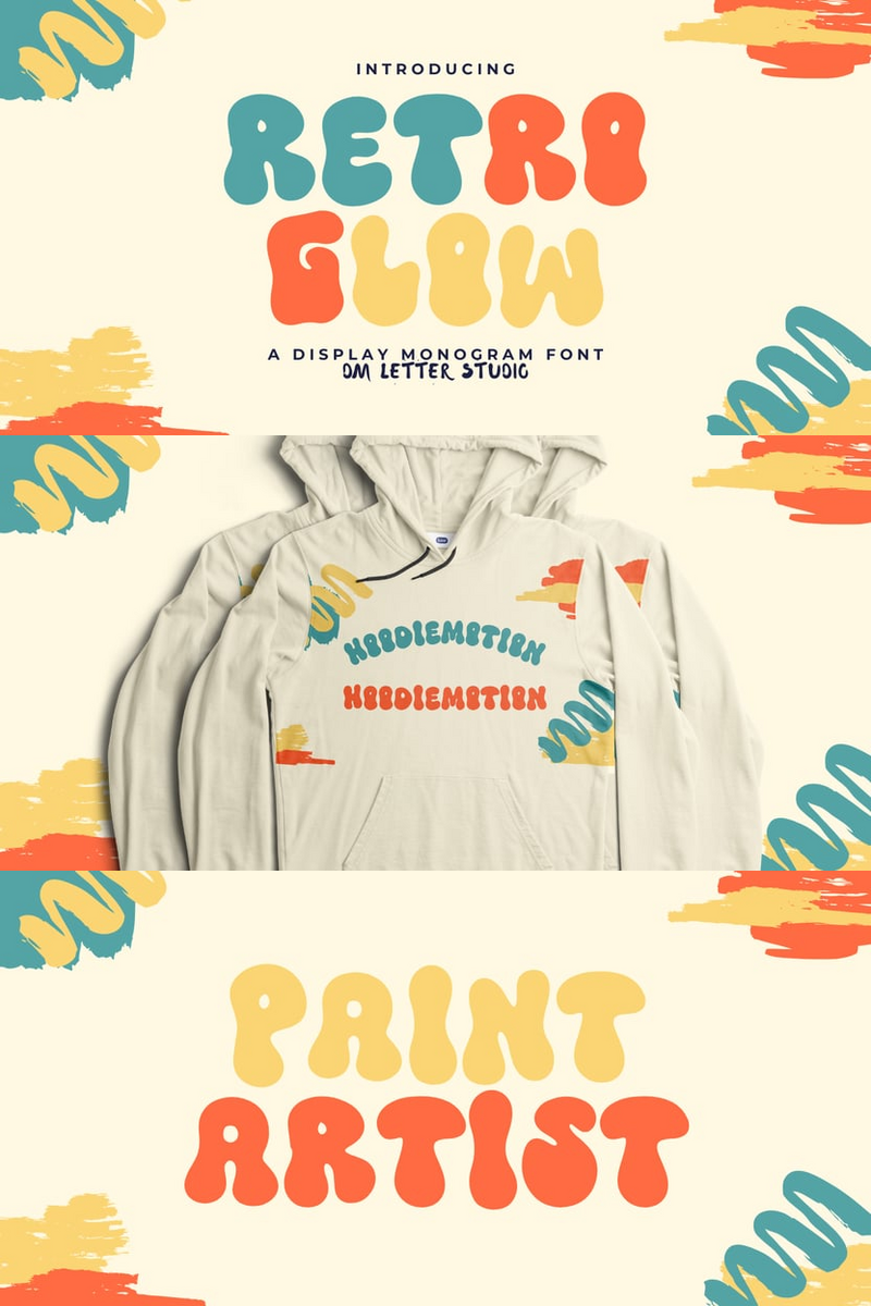
Enhance your designs with this font!


Unveiling Nomos: A Raw and Honest Brutalist Typeface

Start using this font today!


No comments:

Post a Comment

In a Crowded Market, Can Retro Glow's Experimental Artistry Make Your Indie Game's Website Headlines Unforgettable?

Indie game developers pour their passion into creating worlds that defy convention, yet often struggle to find a visual voice as unique as t...