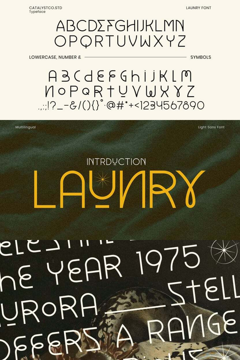
Indie game developers pour their passion into creating worlds that defy convention, yet often struggle to find a visual voice as unique as their vision. Generic typography can dilute a meticulously crafted aesthetic. Enter the Retro Glow font, a typeface specifically designed to bridge this gap, offering an artistic and experimental style that speaks volumes for games that dare to be different.
Retro Glow isn't merely a font; it's a digital artifact, meticulously crafted to evoke a sense of nostalgic futurism fused with cutting-edge experimentation. Its unique contours and deliberate imperfections hint at untold stories, digital glitches, and alternate realities. It's the perfect language for games that challenge the norm, where every visual element contributes to the narrative. This isn't about mere readability; it's about conveying mood, building atmosphere, and establishing an undeniable brand identity from the very first character. The Retro Glow font communicates sophistication with an edge, a blend of the familiar and the revolutionary.
Imagine an indie studio, poised to launch their groundbreaking narrative-driven puzzle game, "Echoes of Aethel." They've built a universe shimmering with forgotten technologies and existential mysteries. Standard fonts would flatten their intricate design. But with the Retro Glow font, their game's title screen instantly captures the player's imagination, hinting at the cyberpunk elegance and experimental themes within. The menu navigation hums with an ethereal glow, and key dialogue sequences resonate with the font's inherent gravitas, drawing players deeper into the lore. Retro Glow doesn't just display text; it weaves it into the fabric of the game itself, becoming an integral part of the player's immersive experience. This distinct indie game font serves as a silent narrator, guiding players through uncharted digital landscapes.
The core value of Retro Glow for indie game developers lies in its power to forge an unforgettable identity. It allows your game to communicate its essence visually, even before a single line of code is executed. It’s an investment in your game's unique brand, ensuring that your website headlines, such as "Unravel the Glitch Protocol" or "Beyond the Static: Explore Tomorrow's Relics," not only inform but deeply intrigue. From bold game titles and subtly stylized UI elements to captivating marketing assets, Retro Glow transforms text into art, setting your project apart in a competitive landscape. This experimental typography for game development ensures your visual storytelling is as compelling as your gameplay.
Retro Glow: Define Your Game's Uncharted Narrative.